The One-Photograph-per-Moment Rule
The one-photograph-per-moment rule can flatten an album’s visual rhythm. Choose event coverage for a clear arc, then vary scale, color, and pace.
Does every moment in a photo album really need one representative image? The one-photograph-per-moment rule can make an album feel like a row of isolated highlights, but adding every frame from an event can turn it into a visual log. The better question is how much coverage helps a reader follow the occasion—and how the pictures look together on the page.
Coverage and rhythm
Event coverage answers, “What happened?” Visual rhythm answers, “How does this page feel to look at?” They overlap, but they are not the same task. A group portrait may document who attended, while its size, color, and position on the page determine whether it gives the sequence a strong opening or makes a crowded spread feel even busier.
Think of an album page as a composition, not a container for every worthy photograph. A broad scene can set the scale; a close portrait can bring the eye inward; a quiet detail can create a pause. The pictures do not need to show different events to create movement. They can revisit one occasion with changes in distance, shape, light, or visual energy.
Build a visual cadence
Before placing images, notice their visual qualities. Look at whether the frame is wide or tight, whether the background is busy or calm, and where the strongest color or contrast falls. Then arrange pictures so neighboring frames do not all demand attention in the same way.
- Repeated scale: If several frames are close portraits, place a wider view between them; if the page already alternates wide and tight images, keep the sequence moving.
- Busy backgrounds: If neighboring pictures both contain dense rooms or crowds, separate them with a simpler frame; otherwise, keep them together when the shared setting is the point.
- Strong color: If one image has a vivid accent that pulls the eye, give it breathing room; if another frame’s color echoes it gently, use the pair to connect the page.
- Similar shapes: If several faces or objects line up in the same way, change their order or choose a different crop; if the repetition creates a deliberate pattern, let it continue.
- Quiet moments: If the page feels crowded, use a calm image as a visual pause; if the sequence already has open space and a soft pace, avoid adding a pause that stalls it.
- Page direction: If a person looks toward the edge of the spread, place the image so the gaze leads into another picture; if the gaze points away from the story, shift its position or pair it with a frame that answers the look.
These checks guide layout, not a fixed formula. A lively spread can use repeated shapes and strong colors on purpose. The useful test is whether the repetition feels intentional or simply makes the page hard to read.
Choose coverage with an arc
For each occasion, identify the moments a reader needs to understand its shape. A gathering might need an arrival, a shared activity, and a closing gesture; a short visit might have one scene that carries the whole story. Let that arc determine the coverage rather than trying to give every person or event the same number of frames.
Then consider visual contrast. If two important moments look alike, their order can still create a sense of change: a room before guests arrive, followed by the same room full of conversation. If two frames have similar compositions but no clear progression, separate them with a different view or leave one out.
How should the page move?
Should album photos follow chronology?
Chronology helps readers understand what happened, especially when a sequence includes a clear change. You can still lead with a striking image, then return to an earlier scene if the captions or layout make the shift easy to follow.
How can I vary photo sizes?
Give a visually strong image more space when it can anchor the page, then use smaller frames for supporting details. If all the images have equal weight, vary their placement or leave more open space rather than shrinking every photograph into a crowded grid.
Should I include a quiet photo?
Include it when its calmer tone gives the page a useful pause or changes the reader’s attention. If it interrupts the occasion’s arc without adding context or atmosphere, place it elsewhere or omit it.
Where do captions fit?
Put a caption close enough to identify its photograph without obscuring the visual flow. Use it for a name, place, or piece of context the image cannot communicate, not to narrate every visible action.
A worked page decision
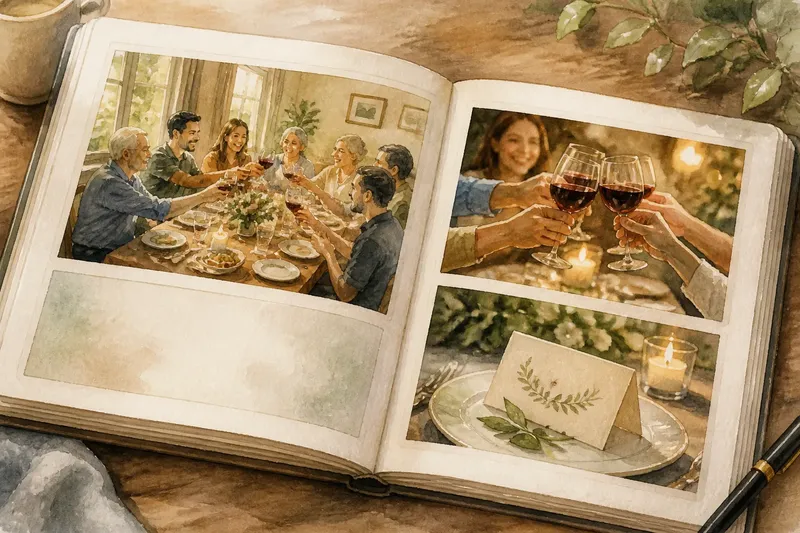
Imagine you are arranging a family dinner and have four candidate pictures: a wide shot of the full table, two close frames of the same toast, and a quiet image of a handwritten place card beside a plate. First, you decide the page should establish the gathering and end on a small personal detail. Next, you compare the toast frames: one has a clear view of the raised glasses, while the other shows a person’s face turned away and repeats the same gesture. You keep the clearer frame, place it after the wide table image, and finish with the place card. The result is a short visual arc—setting, shared action, personal detail—without allowing two similar compositions to crowd the page.
Captions and page flow
Captions can bridge a visual gap. A short note such as “Mara saved the place card for her first visit home” can explain why a quiet detail matters; a caption that merely says “Place card” adds little. Keep wording concise so the image remains the main event.
When you use a photo-book app such as Apple Photos or Adobe Lightroom, preview the spread at the size a reader will see it. A layout that looks tidy as tiny thumbnails may feel cramped once captions and page edges are visible. Adjust the order, crop, or spacing if the eye has nowhere to rest.
When is a spread ready?
Read the page from the first image to the last. Check whether the occasion is understandable, whether the pictures vary enough to hold attention, and whether any visual repetition feels deliberate. If one image only adds another version of the same composition, remove it or move it to a different page where it changes the rhythm.
The one-photograph-per-moment rule is a useful prompt for keeping coverage focused, not a design law. A group of pictures can share an event and still earn its space through a clear arc and a thoughtful change in visual pace. When you make the final choice, ask what the reader’s eye should notice next—not only what happened next.