A Printed Caption or a Handwritten One?
Printed or handwritten photo album captions each suit different needs. Compare readability, tone, and editability to choose a style that fits your collection.
Should you print photo album captions or write them by hand? The choice becomes real when you set a caption beside a favorite photograph: a crisp label can be easy to read, while a note in your own script may feel like part of the memory. The right style depends on who will read the album, how much text you need, and whether you expect the details to change.
Readability and tone
Printed captions usually offer consistent letter shapes and spacing. That can help readers follow names, place names, and longer descriptions, especially when the album has small images or several captions close together. A simple typeface at a comfortable size is generally easier to scan than decorative lettering, which can blur into the page’s visual texture.
Handwriting brings a different quality. A familiar script can make an album feel personal, and small variations in the lettering may carry the same warmth as a note tucked into a book. But handwriting is not automatically legible: pale ink, tight spacing, and letters that resemble one another can make even a short caption difficult for someone else to decipher.
Tone matters as much as clarity. A printed caption can feel calm and organized, particularly when it uses plain language and a restrained style. Handwritten words can feel conversational, as if the person who made the album is speaking directly to the reader. Either style can be affectionate or formal; the wording does more of that work than the medium alone.
Printed captions
Printing suits albums with many captions, repeated labels, or information that needs to be read easily by different people. It can also help when several contributors are preparing pages together: everyone can work from the same text and visual style without needing similar handwriting.
Use a familiar font with clear shapes, and keep the caption visually separate from the photograph. Plain paper labels or captions printed as part of a page can work well, depending on the album design. Leave enough breathing room around the words, and avoid using a background or ink color that reduces contrast.
Printed text is also useful when you want to prepare wording before assembling pages. You can check spelling, compare dates against notes, and revise the phrasing on screen before placing the final version. That flexibility is especially helpful for captions that include several names or details that you want to confirm.
The trade-off is that print can feel detached if every page uses the same polished treatment. A uniform font and identical label may make different moments seem flatter than they are. You can retain consistency without making every caption sound alike: vary the wording to match the picture, while keeping the lettering style stable.
Handwritten captions
Handwriting often suits albums meant to feel intimate, informal, or closely tied to the person who made them. It can preserve the maker’s voice in a direct way: a brief observation, a family nickname, or a small aside may sound natural in a handwritten note when it would seem stiff in a typeset label.
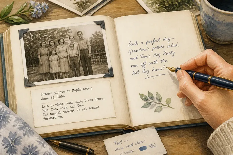
Choose a pen that produces a clear, steady line on the surface you plan to use. Before writing on an album page, try the pen on a spare piece of the same paper. Keep the words comfortably sized, leave space between lines, and write in a color that stands apart from the page. A test on scrap paper is a simple way to check how the ink looks and feels before it goes near a finished layout.
Handwriting is less convenient when captions are long, numerous, or likely to need correction. A typo can be awkward to fix, and squeezing in a missing name may make the whole note harder to read. If you are unsure about a detail, write a temporary draft elsewhere and transfer it only when the wording is settled.
Say you are making an album for a relative who knows the people in a group photograph but may not recognize everyone at first glance. You could type a short line, print the names in a readable size, and add one handwritten note in the margin with a family nickname. The expected result is that readers can identify the group without losing the personal voice that makes the page feel like yours.
A mixed approach
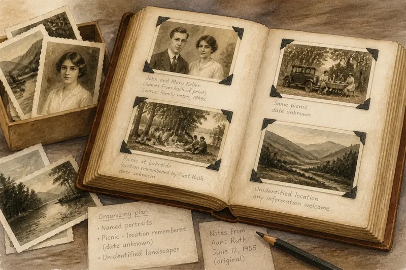
Combining print and handwriting can resolve a genuine conflict rather than simply decorate a page. Use printed text for information that benefits from consistency, such as names or a location, and reserve handwriting for a personal aside. This division gives the factual details a clear presentation while letting a small note carry the maker’s tone.
Keep the two styles visually related. For example, pair a plain printed caption with handwriting in a similar ink color, or place a short handwritten note beneath a tidy printed label. If every element competes for attention, the reader has to work to decide which words matter most.
A mixed style is less suitable when the album calls for a strictly uniform appearance or when you want every page to be easy to reproduce. In those cases, use one primary method throughout and let the wording provide variety. A restrained, consistent system is easier to maintain than a combination that changes without a clear reason.
How should you choose?
Which style is easier to read?
Printed captions usually provide more consistent letter shapes, while neat handwriting can be just as readable for short notes. Consider the actual page, the size of the words, and the people likely to read the album rather than assuming one medium is always clearer.
Which works better for a personal album?
Handwriting can make a caption feel closely connected to its maker, especially when the wording sounds like ordinary speech. Print can still feel personal if the language is specific, warm, and shaped for the photograph rather than copied from a generic label.
Can you change a printed caption later?
It is usually easier to revise a digital text file before printing than to alter a finished handwritten note. If a printed caption is already in the album, a replacement label may be possible, but the result depends on how it is attached and how the page is designed.
When does a mixed style make sense?
Choose both when some information needs clear, repeatable presentation and a separate note would benefit from your own voice. If the combination makes the page look crowded, return to one method and shorten the caption instead.
A simple decision
Start by asking what the caption needs to do. If it must carry several names, be read quickly, or match labels across many pages, print is a sensible default. If it is a brief thought meant to sound like you, handwriting may be the better fit. If those needs pull in different directions, print the identifying details and handwrite only the personal addition.
Think about future edits before you write. Names can be misremembered, dates can need checking, and an album may pass to someone who wants to add context. Keep uncertain information in a draft until you can verify it; for established captions, retain a copy of the text if you may need to update or reproduce a page later.
Whichever style you choose, let the caption stay secondary to the photograph while giving the reader enough to understand what matters. A clear printed line, a legible handwritten note, or a deliberate blend can all serve the album. The most useful choice is the one that lets someone read the words easily and still feel the moment behind them.